Tuesday, April 23, 2013

So you wanna know what a teacher portfolio looks like? Take a look at mine

I'm going to leave out the resume page and my references for privacy purposes. This is what I used straight out of college. If you are trying to get a job, make you self one!


Pop art portraits 7 th grade

Two words: Roy Lichtenstein. Students learned all about the great 20th century artist and how he used "benday dots" to create value. I showed them how to use a bold marker to create the benday dots while using a ruler to keep everything straight. I had originally assumed that Lichenstein used benday dots in the hair. I was wrong. Students referenced the way Lichenstein colored in hair: yellow with black streaks, brown with black streaks, and black with blue streaks.

I realized that Lichenstein never painted a person of color, that I could find anyway. That was awkward when trying to show examples. Even though I went out and bought multicultural markers, all my student examples look white, despite half these students have brown skin. Humm.....interesting?

Supplies: paper, pencil, bold multicultural markers, card stock for speech bubble.


8th grade expressive grid portraits

I like to do a grid portrait first with 8th grade. This year I wanted the portraits to be a little more expressive and dynamic. I showed students many examples of expressive artist including the Fauves and Andy Warhol. I got a strange mix of projects. That's good, right?

Grinding with middle school can be the biggest pain of all time. My team finally came up with a simple way to do this.

Take a one inch plastic ruler and trace the ruler in rows vertically and horizontally on your 8 1/2 x 11 photo. This will give you one inch squares. This requires no notch making!

Take a standard 28 x 22 poster board and do a two inch grid using the same method as above. My colleague found some cardboard to make a two inch wide "ruler". It works fabulous.

The poster board will end up with more squares so just trim off the excess.

We used oil pastel to create the value. I encouraged them to be expressive with color choice.

Supplies: 8 1/2 photo, 22x28 poster board, 1 inch wide ruler, pencil, 2 inch wide ruler made from cardboard strip, oil pastels ( or colored pencils)


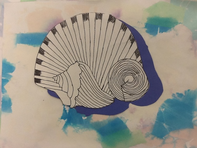
Sea shell contour line 6th grade

After all that practice drawing shells, it seemed a shame not to squeeze one more project out of it! I bought a giant bag of shells at Michaels for about $10 and had the student choose their own shells and arrange them into a personal still life. At this point my student had already been introduced to contour drawing. I reminded the often to, "draw what you see, not what you think a shell looks like."

Kids had the most problems with the simple shells, like the one in the Shell Gasoline logo. I also encouraged students to draw the shell from the side with the opening. This made the drawings a little more dynamic.

The backgrounds of these are done with tissue paper pieces wet down with a spray of water. After the water dries, remove the tissue paper and you are left with the wonderful "bleeds" the paper left behind. Students cut a matching blue shadow to give the work some depth.

Supplies: pencil, thin black sharpies, a variety of matte tissue paper cut or torn in 1-2 inch pieces, drawing paper, blue construction paper, glue, sea shells for observation


Pastel sea shell Georgia O'Keeffe 6th grade

We explored abstract drawing for this Georgia O'Keeffe inspired project. I was sort of puzzled to find out that hardly any of my 6th graders had a working understanding of abstraction, and to add insult to injury, had never heard of O'Keeffe! Needless to say, we hit both subjects pretty hard!

For this project I wanted students to learn the difference between drawing an abstracted view and a "whole view". We did several thumbnail sketches. Somehow, even after 3 demos, I still had students drawing whole view and not comprehending the concept of cropping in and altering the image. It took some work, but I checked thumbnails and insisted students "abstract the shells!" before we went any further.

I always like to read stories or show videos about artist we are going over. I found a book called My Name is Georgia to read the kids. It bored them to tears. Literally, their eyes were watering from trying to keep their lids open. I do think its a sweet story that tells about her process and what inspires her so it was worth it.

Students took their two favorite abstracted thumbnails and drew them large in chalk pastel. This gave me the opportunity to teach shade, tint, and blending techniques. They were forbidden from using black pastels! This is important to keep the colors bright and non muddled.

I gave the kids freedom to use unrealistic colors like O'Keeffe. They had a blast blending the colors and creating their own compositions. I told them that the most successful abstractions used neutrals as well as bright colors. The results were fabulous.

Supplies: sea shells for observation, pastel paper (I used really cheap watercolor paper), chalk pastels, newsprint ( to create a protective jacket)


Two point Surrealist cityscapes

I have been playing the last couple years with a way to turn a boring two point perspective lesson into something a little more special. Last year 6th grade completed a two point perspective city of the future. The kids did an awesome job and the project allowed for a variety of end projects.

This year, 8th grade completed Surrealist Cityscapes. I was able To pack in so much art history into this project! We started by viewing Disney's Destino short. I found this easily on YouTube. The kids were fascinated by surrealism after watching Destino. Salvador Dali and Walt Disney collaborated on the film but it was not made until 2002. The result, is a modern animation set to chilling music showing a huge scope of surrealist ideas.

We also watched "Get Surreal" from YouTube. Yes, it is super cheesy, but chalked full of great vocabulary and concepts. (I would post the links, but they always seemed to be removed :( )

Key terms: two point perspective, vanishing point, horizon line, orthogonal, vertical, Salvador Dali, surrealism, dislocation, juxtaposition, transformation


Wednesday, October 10, 2012

Leonardo Portraits

Everyone loves a good portrait lesson right? We just wrapped up a huge Leonardo Di Vinci unit. The before drawing were done before the kiddos learned how to grid.

-->
LESSON TITLE:  ¾ portraits with Leonardo
GRADE: Middle School 8
CONCEPTS, KNOWLEDGE, & SKILLS to be covered in this lesson: Grid Drawing, Value, Realism
SUPPLIES: 1 sheet poster board per student, access to a printer (b&w), a variety of drawing pencil (or a #2 if that is all available), one 2”X24” strip of poster board  per student.
OBJECTIVES:
1.The students will draw pre assessment portraits
 2. The student will Enlarge a photograph of themselves using the grid method
3. The students will  add value with a variety of pencils
4. The students will explore the art of Leonardo Di Vinci including what makes the Mona Lisa so famous
ASSESSMENT:
1. The teacher will use a written assessment about the Leonardo and his paintings
2. The teacher will evaluate gridding technique 
3. The teacher will  evaluate correct value techniques

TEKS for Visual Art:
8.1 (A) The student is expected to  illustrate ideas from direct observation
8.2 (A) create artworks integrating themes found through direct observation and personal experiences
8.4 (B) The student is expected to analyze artworks by others to form conclusions about formal properties, historical and cultural contexts, intents, and meanings.

Interdisciplinary Connections:    History

4 KEY PHASES:

1. Connecting/Motivating: Students will need to complete a pre assessments without any instruction if possible.  Students will be introduced to Leonardo’s Mona Lisa via a short youtube video. Discussion Questions: Who was the Mona Lisa most likely? What are some theories on her identity? How was the ¾ pose revolutionary? What intrigues you about the Mona Lisa?

2. Teach, Model, & Demonstrate: Students will compare two Leonardo paintings and evaluate how art advanced in the Renaissance via PPT (attached). Students will be introduced to grid method and teacher will demonstrate grid worksheet. Teacher will also model how to grid a photograph and a poster board. (1 45 minute class)
                       Gridding a portrait the easy way: Student will use a 1” wide ruler and line it at the top of an 8 1/2 X 11 vertical photograph of the student’s portrait. Draw a line underneath the ruler with pencil. Slide the ruler down and line it with the first pencil line and draw another line under the ruler. Repeat step until you reach the bottom. Repeat steps horizontally on the photograph as well. Next, use 2” strip of poster board and line it at the top edge of the poster board vertically and draw a line underneath. Repeat step down vertically, then horizontally to form a grid. Count the rows of boxes on the photograph and trim down poster board until the photograph and poster board have the exact same number of boxes.

3. Try It-Tests-Practices: Students will complete grid worksheet individually while a designated student (or teacher) photographs class members in ¾ pose. Students need to make sure they display any jewelry or other objects that may symbolize their identity.
4. Create:  After checking student’s comprehension of gridding by evaluating practice worksheet. Instruct students to outline main facial contours with a bight colored pencil to help them see the lines. Students will then begin to work independently to enlarge their photograph to the poster board. (2-3 45 minute classes)

Once basic contours of the face have been drawn, students will begin to add value with a pencil. Remind students to push values (use value chart). (3-4 45 minute classes).
before

after
after

Before
HERE IS THE PPT I USED